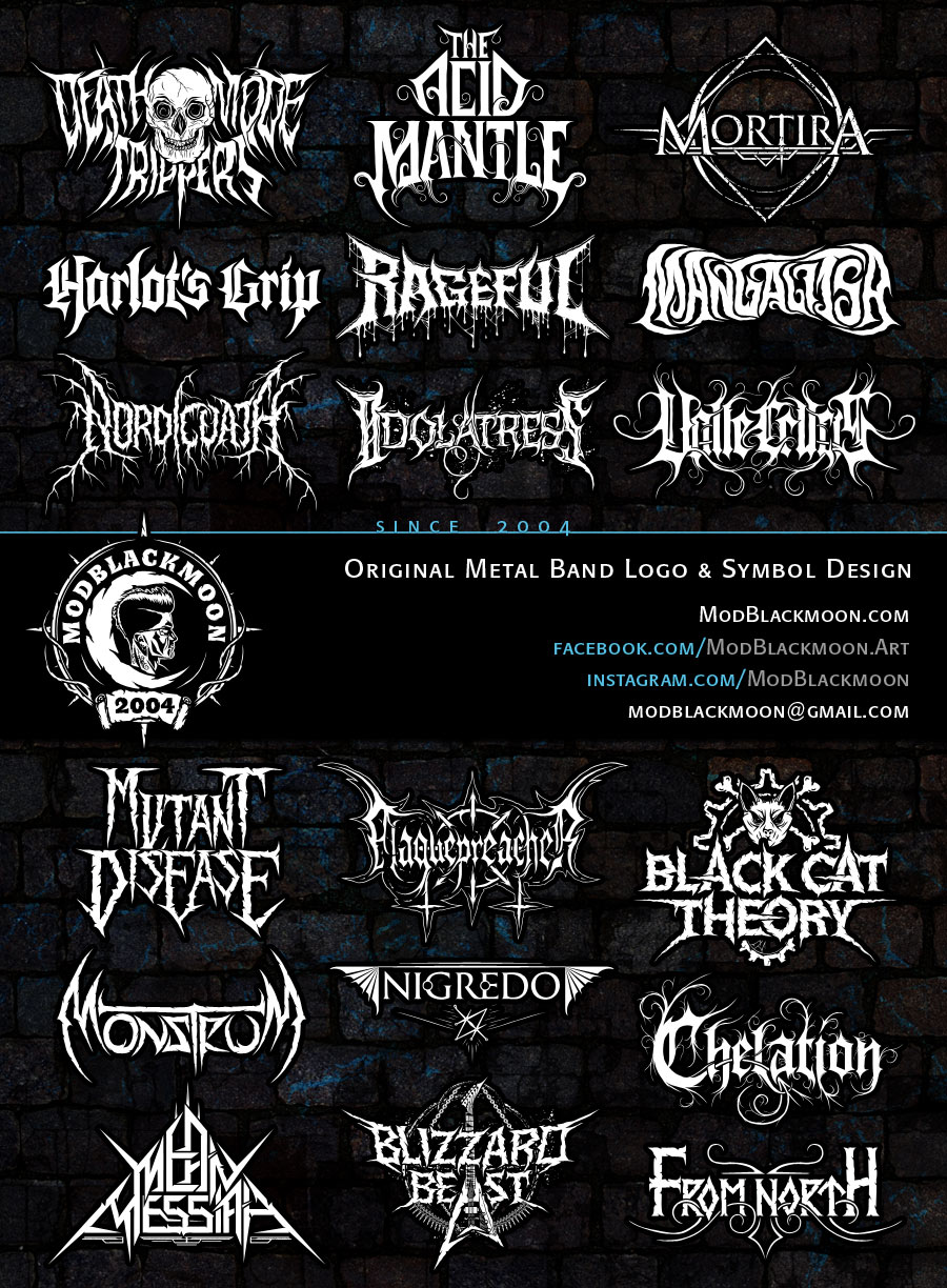
I manually draw Logos and all kinds of Lettering Art since 2004 (running my website since January 2005). Mostly i work for artists, metal bands, private individuals. I also design metalhead and gothic personal name tattoos, since the workflow is the same for all hand-drawn names. If you want to make a request just contact me or my manager by e-mail or on Facebook and Instagram. Styles i prefer to work with: Black Metal, Death Metal, Grindcore, Heavy and Thrash Metal oldschool type designs, Deathcore and Metalcore, Gothic Metal, Doom Metal. I'm always up for drawing something different from the majority of band logos.
I provide high resolution files 6500px wide, 300dpi - perfect for professional prints or any production. Vector PSD, AI, EPS, TIFF files and raster PNG with transparent background, JPG images. Ask for PDF files if you need.
- Band Logo Design, Personal Name Tattoo, Band Symbol or Emblem, Personal Monogram, Metalhead Lettering, Sigil Design, drawing Logotype based on Client's sketch - €60 EUR | £50 GBP | $66 USD Price for single design including two revisions with tweaks if necessary.
- Existing Logo Improvement - from €30 EURIf you already have digital logo but want to improve the quality and get a vector file.
- Revisions: Price includes two Revisions with adjustments to your liking.
- Color and Textures - Adding desired Photoshop Effects is free as bonus.
- Payment Method: PayPal (under British Management). Payment Methods may vary upon agreement with customer.
- Timeframe: The job takes from 3 to 8 days to complete, as i work with queued requests.
Sometimes I accept promotional design jobs. This way works for bands with over 800 followers on Facebook or Instagram.
Hand-drawn Black Metal Logo Designs, from traditional Old School True Black to Pagan with Folk elements and Avantgarde. The style doesn't limit the visual appearence of the Logo. You can see some organic roots and branches with rough jagged weathered edges and embedded illustration with wild or mythic animals, as well as smooth legible designs that lean towards tough Heavy Metal.


If you'll take a look at modern Death Metal Logos you may notice that there is huge variety of styles. As a graphic designer i usually work with almost any style, it can be simple and legible but still brutal and tough, or it can be high detailed artwork connected with veins, roots, dripping or have overall leaking style. The only style i prefer not to work with is 'the Cough Up Hairballs' logos, when you barely can tell if it's even a word.


Metalcore Logo Design is usually based on simplified letter shapes with particles, splatter, chips and/or curved ornaments. Deathcore Logotype Designs are exaggerated, brutal and less legible. Both styles have rather modern look with either very bold or quite thin letters.


I've listed here all band emblems and logos that are perfectly readable, atmospheric, still extreme metal but don't fall into any specific genre. I think the advantage of neutral Metal Band Logotype is that it doesn't require to be adjusted if the band decides to develop their style further.


Both styles is a blend of sharp long spikes, fairly legible predominantly geometric lettering and smooth or slightly cracked edges. The Logotype often goes with high contrast outline.


Terms of Use: The Artworks are for preview only, and may not be modified or used in any other way. Every lettering design has been made by request and has its owner. You can place your request if you want to get your own original lettering done.